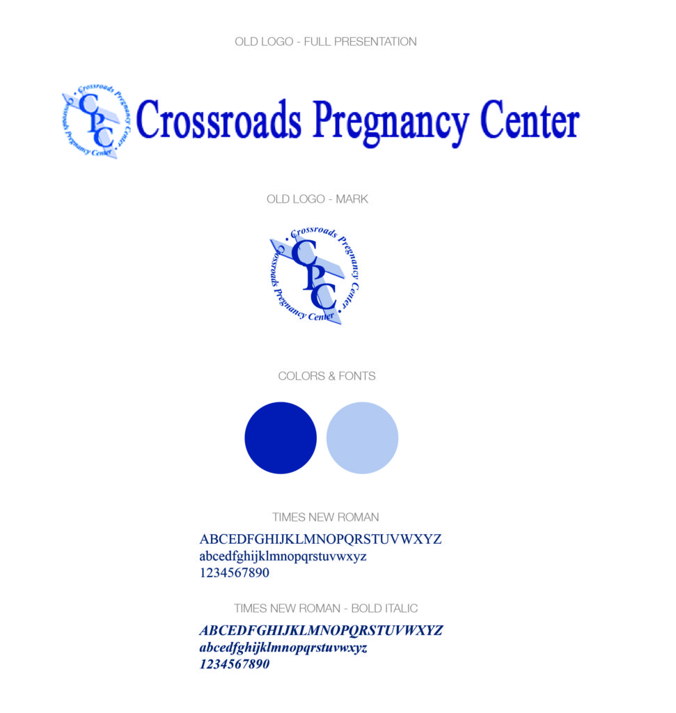
After over twenty years of caring for the community of Pontiac and Auburn Hills, Crossroads Pregnancy Center needed a logo redesign. They approached Character Eight in the spring of 2016 and we immediately began work on modernizing their brand identity. Crossroads’ previous logo was lacking in its ability to tell their story to their target audience. Good brand logos are easily recognizable and clearly tell the organization’s story with simply imagery, color, and font choice.
Crossroads Care Center is a non-profit, Christian organization that is dedicated to assisting abortion-vulnerable women and men involved in a crisis pregnancy, to choose life for their unborn children. Toward that end, they are also committed to encouraging godly sexual attitudes and practices in their community.
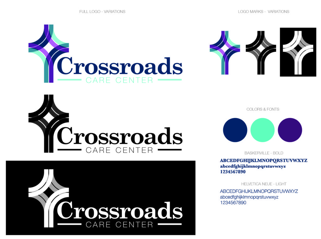
To update the design for Crossroads Care Center we used a simple mark that blends together the imagery of a cross and a two-track road. We freshened up the font choices and used an attractive yet modern color scheme. We stayed with the dark blue used in the previous logo so the brand identity didn’t change too drastically. The light blue incorporates a sense of care and awareness that Crossroads isn’t just a center for women, while the deep purple in the logo draws in the obvious target of the young woman. We believe the new identity will connect well in the demographic Crossroads is working with and will help to engage a younger audience within their geographic region.
To learn more about Crossroads Care Center and their involvement in their local community visit CrossroadsPregnancy.org.


